Guardian-NYTimes-NewsApp
Guardian-NYTimes-NewsApp is made using JavaScript, React, Node and CSS3.
Project link
Description: Guardian-NYTimes-NewsApp allows users to search for news using autocomplete, see news articles, share news articles via facebook, twitter or email, navigate to news articles on click, bookmark news articles and also comment on the articles. The front end is responsive to screen sizes.
The main pages from the application:
- Home Page for Guardian and NY times
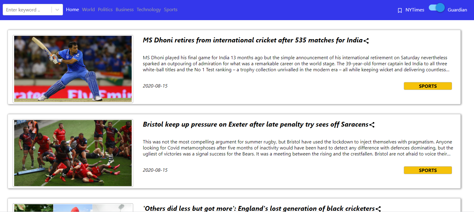

- World Page for Guardian and NY times

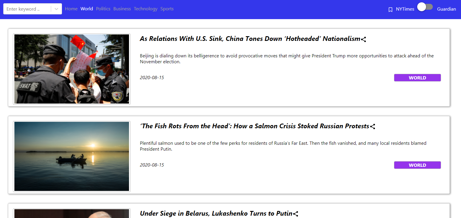
- Politics Page for Guardian and NY times
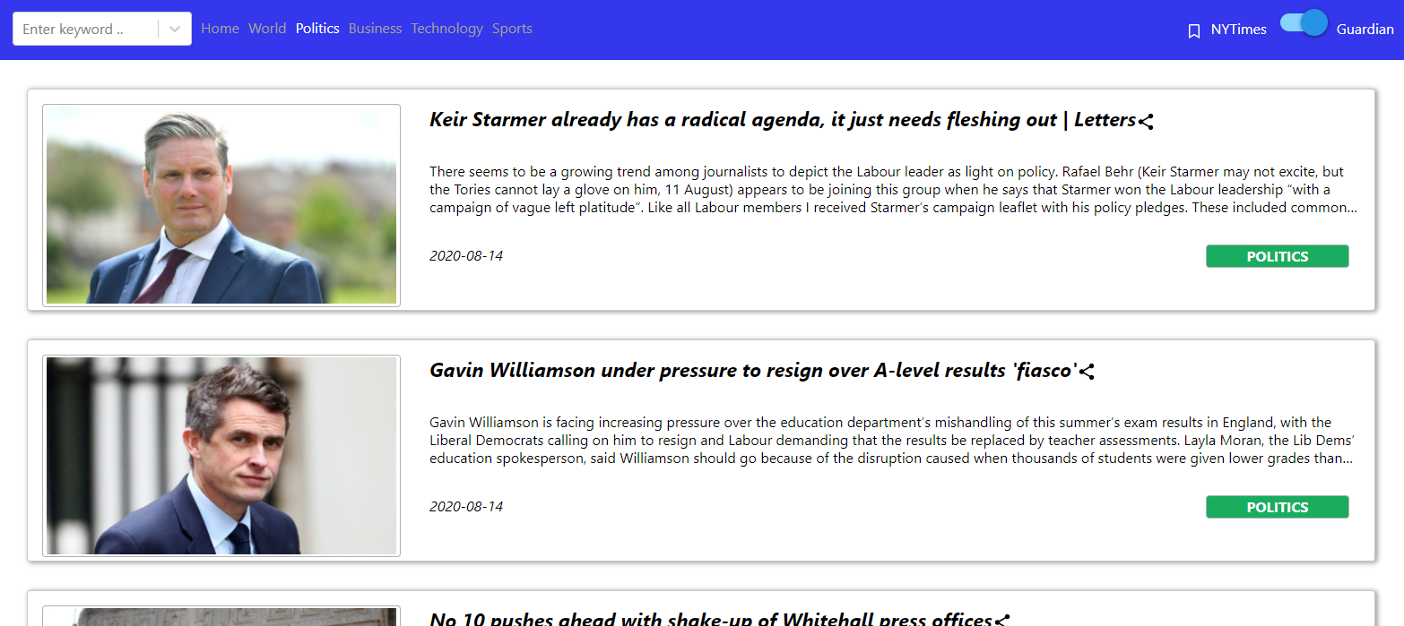
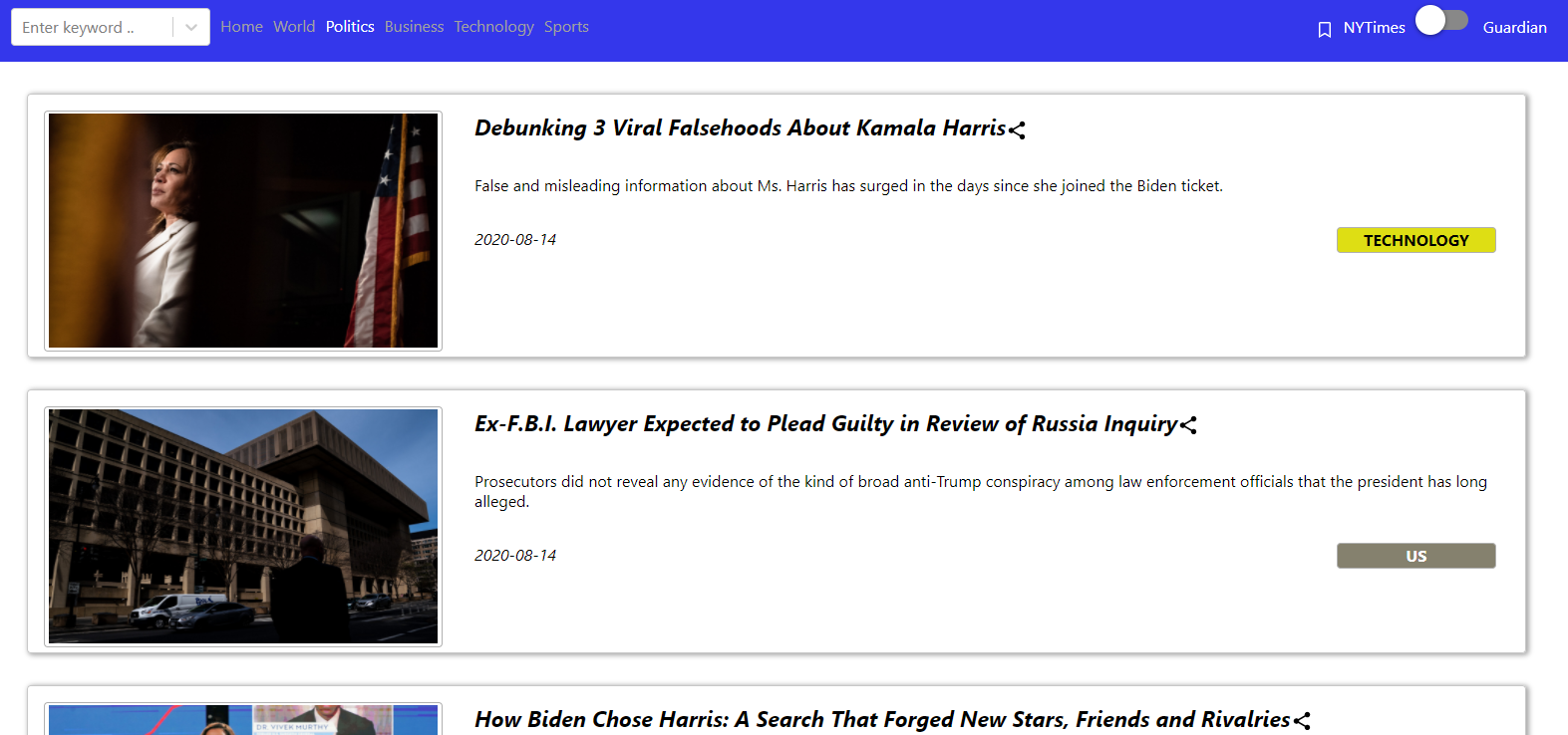
- Business Page for Guardian and NY times

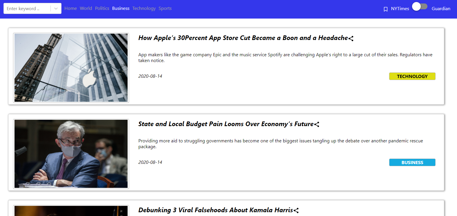
- Technology Page for Guardian and NY times
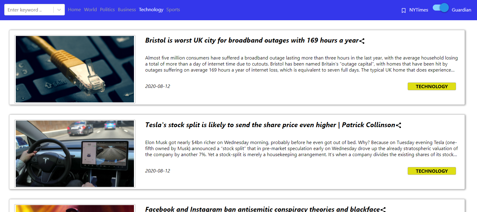

- Sports Page for Guardian and NY times

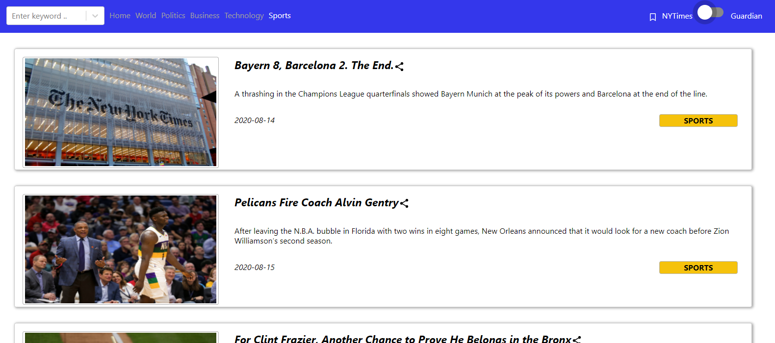
API created in Node for one of the GET requests:
app.get('/getCards/Guardian',(req,res)=>{
Request.get("https://content.guardianapis.com/search?api-key="+apiKey+"§ion=(sport|business|technology|politics)&show-blocks=all", (error, response, body) => {
if(error) {
console.log(error);
res.send(error);
}
console.log(JSON.parse(body));
var to_send=JSON.parse(body);
res.send(to_send);
});
});
Code snippet handling the call request from React front-end:
class BodyCards extends React.Component{
	constructor(){
		super()
		this.state={
			name:"Anamay",
			counter: 0,
			data:{},
			didReceive: false
		}
		this.refresh=this.refresh.bind(this)
	}
	refresh(){
		console.log("Refresh Called:")
		this.setState({didReceive:false})
	}
	componentDidMount(){
		this.refresh()
		var pap=this.props.paper
		fetch("https://nodeanamayproject.wn.r.appspot.com/getCards/"+pap)
		.then(response=>response.json())
		.then(dataset=> {
			this.setState({
			data:dataset,
			didReceive:true
		})
		})
	}
Each of the news articles can be shared.
Clicking on the share button, opens a modal as shown below. It has the options to share via facebook, twitter and email.
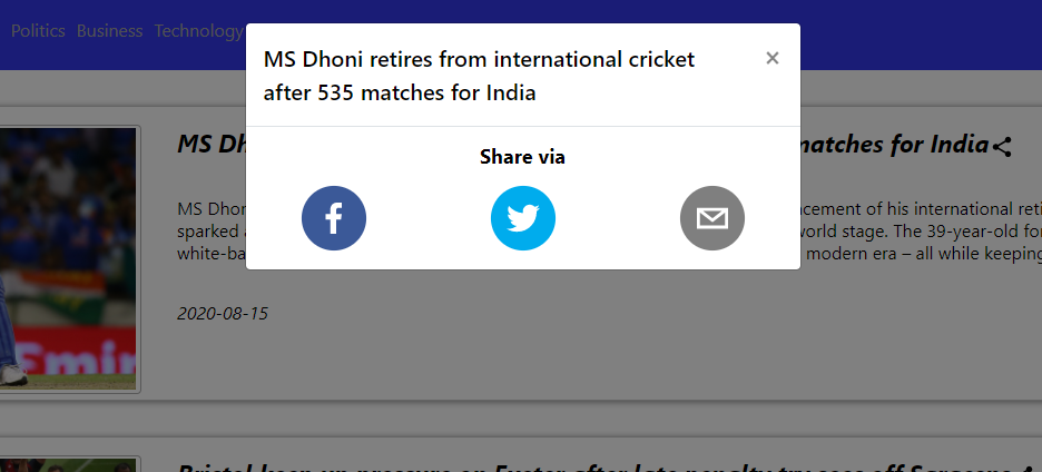
The share components were imported from react-share. A code snippet for creating the share items in the modal is shown below:
    import {
    EmailShareButton,
    FacebookShareButton,
    TwitterShareButton,
    FacebookIcon,
    FacebookShareCount,
    TwitterIcon,
    EmailIcon
    } from "react-share";
<div className="Icons">
    <div className="Facebook">
        <FacebookShareButton url={this.props.webURl} hashtag={"#CSCI_571_NewsApp"} >
            <FacebookIcon size={60} round={true}/>
        </FacebookShareButton>
    </div>
    <div className="Twitter">
        <TwitterShareButton url={this.props.webURl} hashtags={["CSCI_571_NewsApp"]}>
            <TwitterIcon size={60} round={true}/>
        </TwitterShareButton>
    </div>
    <div className="Email">
        <EmailShareButton url={this.props.webURl} subject={"#CSCI_571_NewsApp"}>
            <EmailIcon size={60} round={true}/>
        </EmailShareButton>
    </div>
</div>
Clicking on the individual cards, opens a detailed page of the news as below:
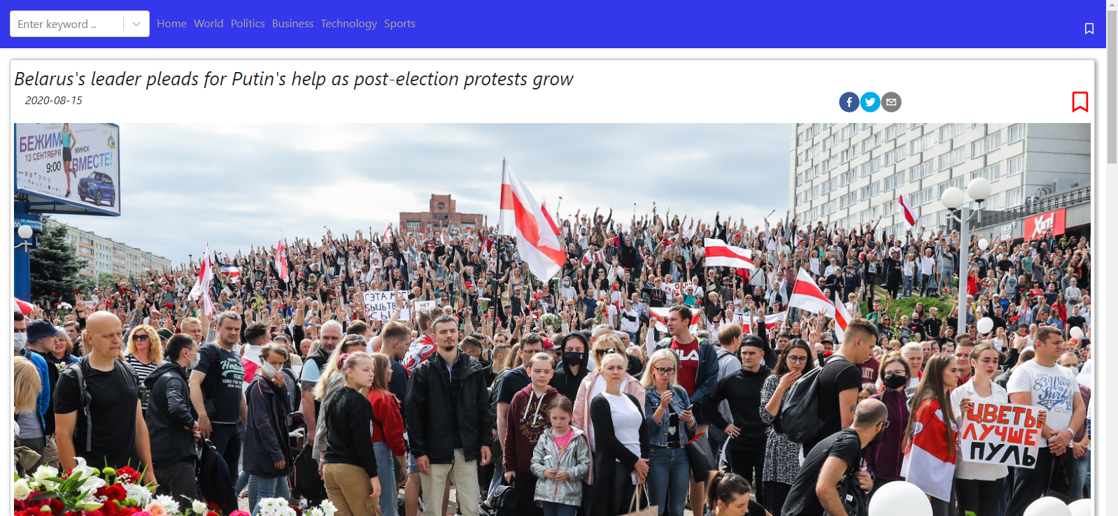

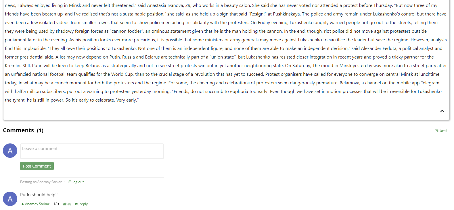
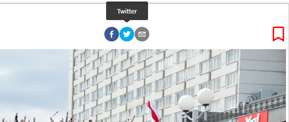
Each of the share icons, when hovered over, show a tooltip:
The user has an option to comment on the the articles.The comment box looks as follows:
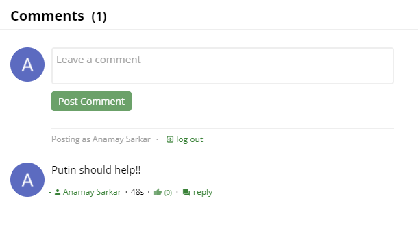
It uses the commentbox from commentbox.io. A code snippet for creating the comment-box is shown below.
class PageWithComments extends React.Component {

    componentDidMount() {
		this.removeCommentBox = commentBox('5677117685628928-proj');
    }

    componentWillUnmount() {
        this.removeCommentBox();
    }

    render() {
        return (
            <div className="commentbox" id="1"/>
        );
    }
}
The articles can be bookmarked for future reference. Bookmarking the articles, adds them to the local storage. Saving them, pops up a toast as shown below:
Snippet of using local storage:
    localStorage.removeItem("curTab")
	localStorage.setItem("curTab","Home")
They can be viewed by clicking on the bookmarks tab.
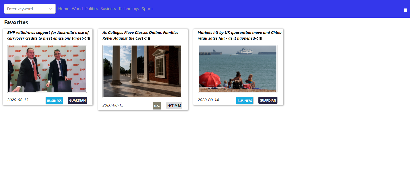
Each of them can be shared, deleted from bookmark or clicked to open the detail page.
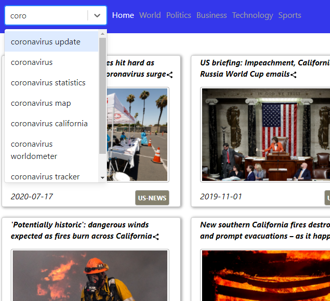
The application, also allows to search for news. The news search box also provides an autocomplete.

A code snippet for the search auto complete is shown below:
<div className="searchBOX">
	 <AsyncSelect
          cacheOptions
          loadOptions={
            _.debounce(this.loadOptions, 500, {
              leading: true
            })}
          defaultOptions
		  value={this.state.inputValue=="" ? null : {label:this.state.inputValue, value:this.state.inputValue}}
          onInputChange={this.handleInputChange}
		  onChange={this.onChangeFunc}
		  placeholder='Enter keyword ..'
    />
</div>
handleInputChange = (newValue: string) => {
    const inputValue = newValue.replace(/\W/g, "");
    this.setState({ inputValue });
	console.log(this.state.inputValue)
    return inputValue;
};
onChangeFunc= (optionSelected)=> {
    const name = this.name;
    const value = optionSelected.value;
    const label = optionSelected.label;
	this.props.history.push("/spin")
	this.retrieveCards(value)
	this.setState({inputValue:value});
  }
On selecting an item, a page showing the matched news articles appears.
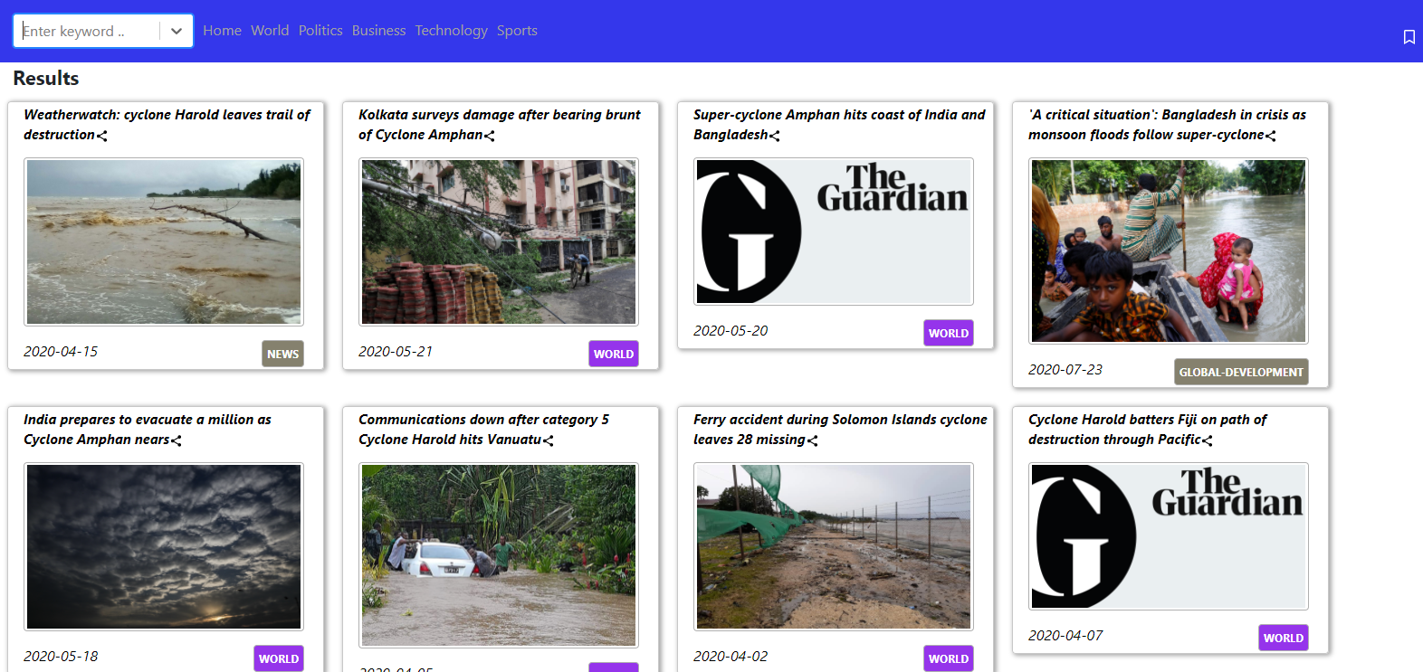
Each of them can shared or clicked to open the detailed page.
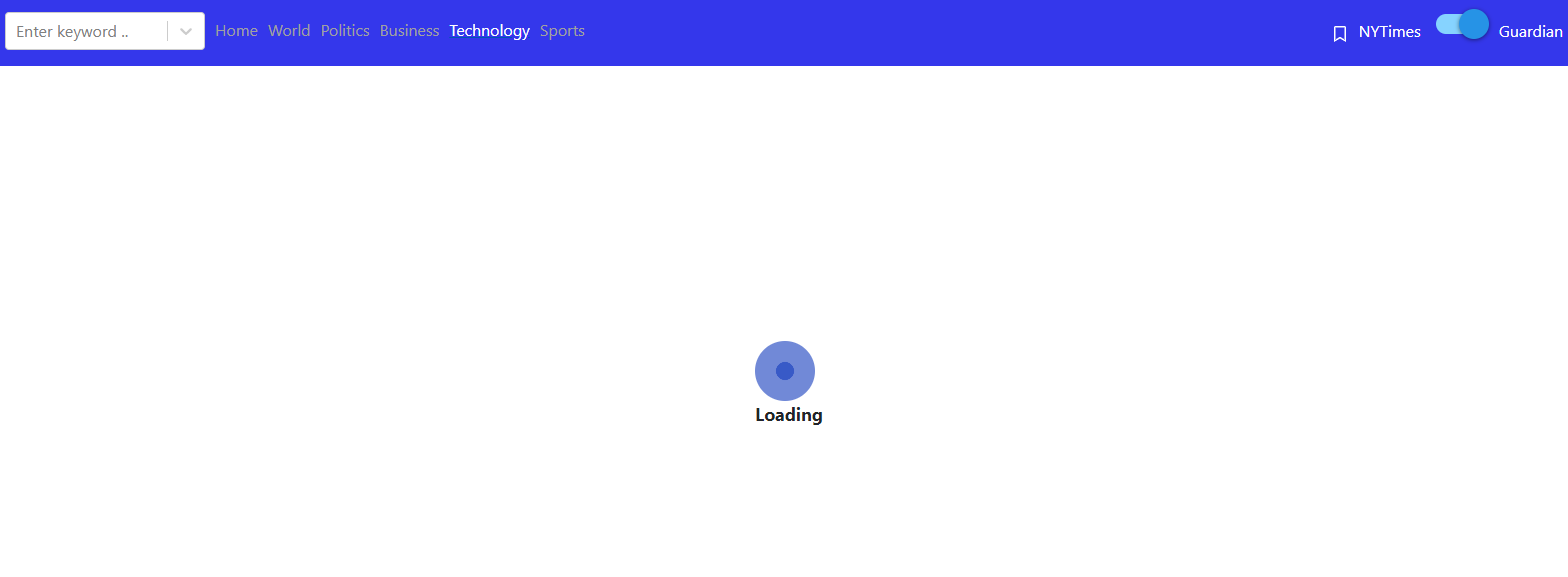
A spinner is showed on all the pages, before the data is fetched from the backend.
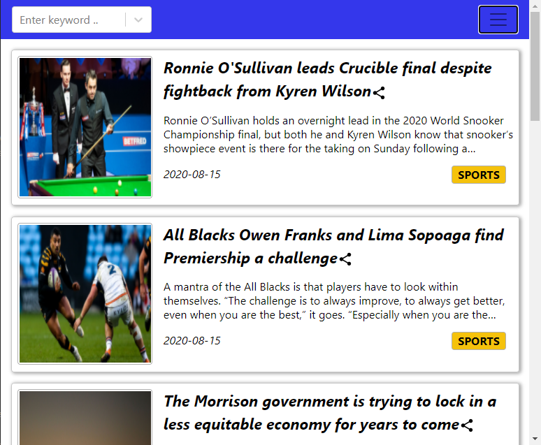
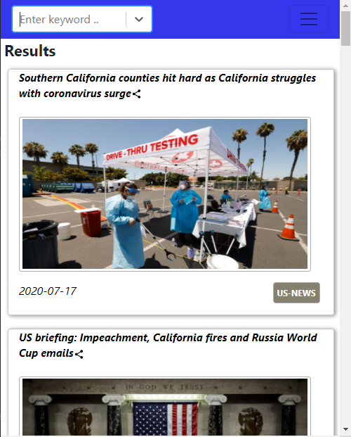
The website is responsive to the screen sizes. It is made possible using media queries and react-bootstrap. Sample code:
<MediaQuery minWidth={768}>
    <div className="smallcardHome" style=color>
        <div className="smallcardTitle">
        {this.props.Title}
            <div className="noMargin" data-toggle="modal" data-target={ids} onClick={this.handleClick}>
                <MdShare/>
            </div>
        </div>
        <div className="smallcardImage">
            <img src={this.props.ImageURL}/>
            <Modal webURl={this.props.WebURL} Title={this.props.Title}/>
        </div>
        <div className="smallcardLower">
            <div className="smallcardDate">
                {curDate}
            </div>
            <div className="smallcardSection" style=>
                {Sec}
            </div>
        </div>
    </div>
</MediaQuery>
import {Navbar, Nav, NavItem, NavDropdown, Form, FormControl, Button} from 'react-bootstrap';
<Navbar className="color-nav" collapseOnSelect expand="lg" >
    <Nav>
        <div style=width>
            <SearchBox2/>
        </div>
    </Nav>
</Navbar>
In a tablet, it looks as below:
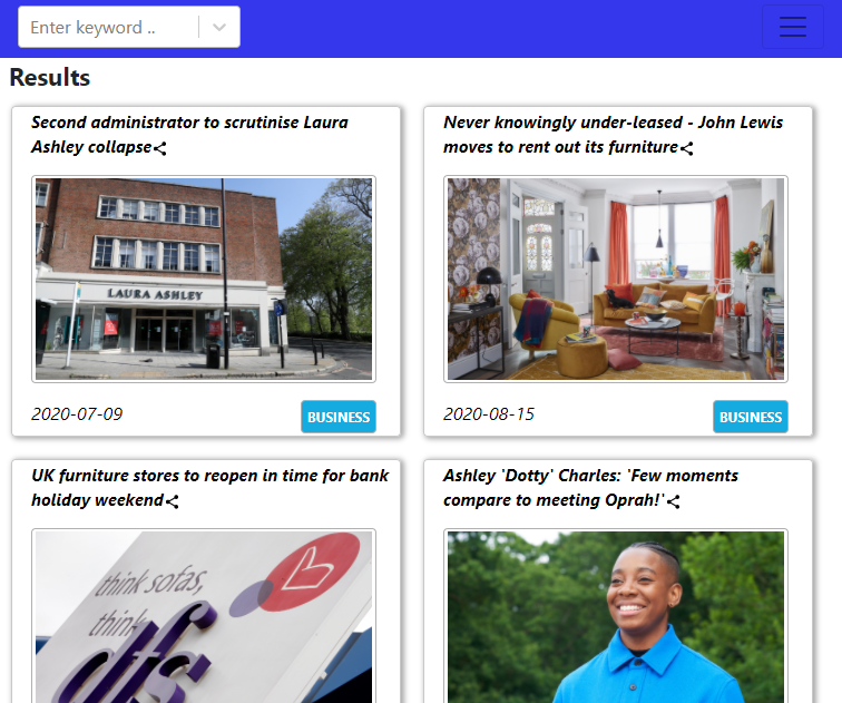
In a mobile screen, it looks as below:

Link to github repo for the entire code. The project’s backend and front-end are hosted at Google App Engine at Google Cloud Platform.
Additional Materials:
- Guardian News: Documentation
- NY Times: Site
- React Share: Documentation
- Comment Box: Docs
- Microsoft Bing Auto-Suggest Site
- Google Cloud Platform Google App Engine

